We, as ‘the outside world’ don’t share in that stigma. We can show our faces without any fear of repercussion. However, it is as if we choose not to. It is time that we learn from these communities. By participating in Alice’s success, we share the stigma, to better break it.
It is no longer about who we are (or may have been), it is about demonstrating what we can do.
These women are considered faceless, yet they hold so much power. Their newly acquired skills are the key to maintaining Italian traditions and craftsmanship.
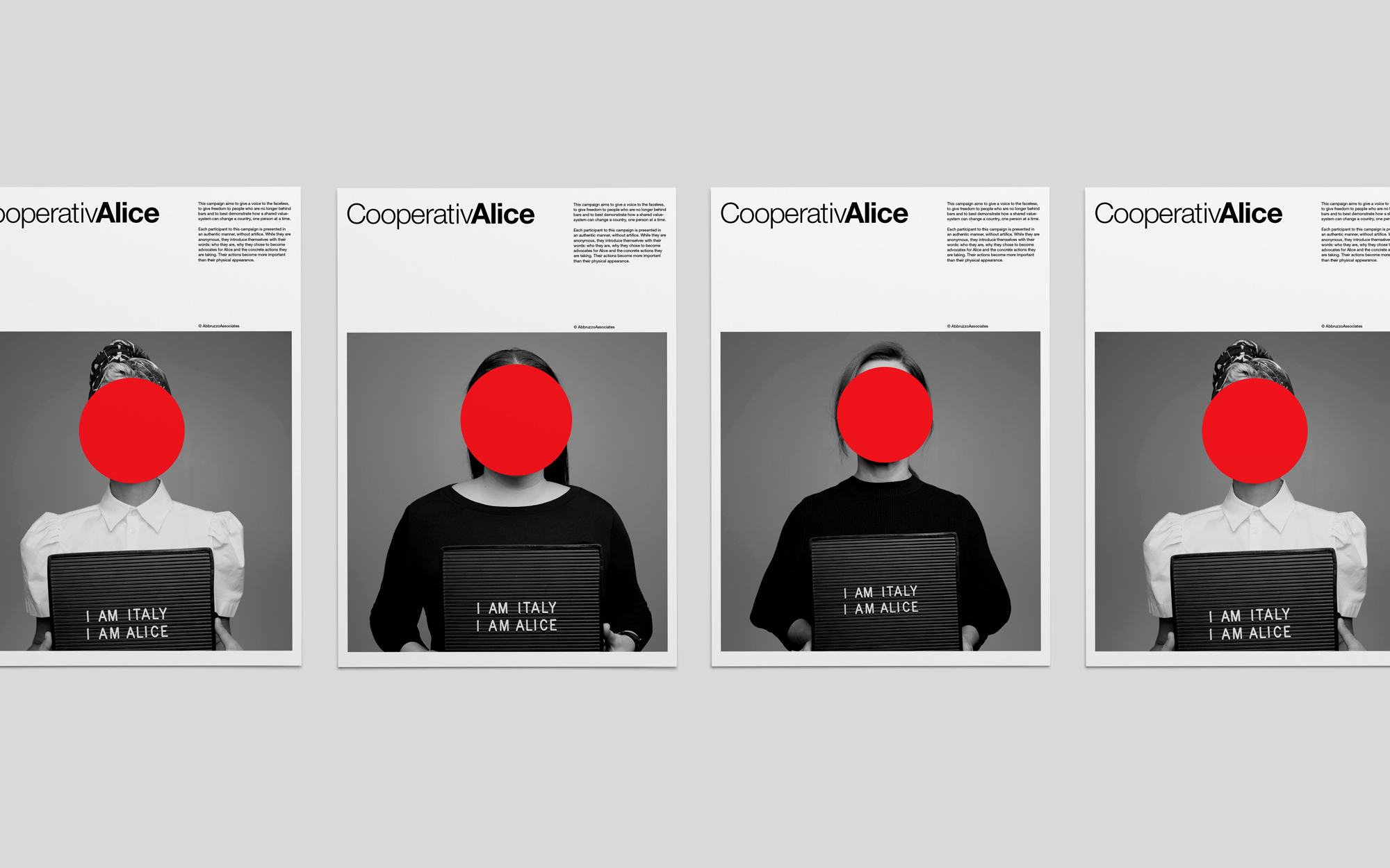
Evoking the work of John Baldessari, each participant has Alice’s logo placed on their faces. By abstracting the models faces, everyone becomes simultaneously as faceless, yet as powerful as Alice’s employees.
Baldessari’s work with the colored circles conjure the importance of looking beyond the surface, to dig deeper than what we see at first glance. He took mundane civic events and transformed them into a scenario-where the elements normally perceived as secondary- now become the focus. Creating a color code, he utilized red to evoke a sense of urgency, giving that person an aura of danger.
In this campaign, we appropriate this idea of dangerous people and make the viewer alter their preconceived notion of appearances. Since we do not see the face of the model, one can not judge based on physicality. Their presence in Alice’s sphere is not based on where they come from, but what they are doing to the organization succeed. Their stories are what matters.
The color red no longer becomes a symbol of danger. Red now unifies us all. It becomes a new visual reference.
Each person becomes just as much of a stakeholder as the faceless few, behind the scenes. We all become Alice; therefore, we all become Italy.
As members of the Alice community, we are equal in the process. We erase borders, nationalities and social classes. Being Alice means that you share the same values of work, legacy, pride, craftsmanship, sustainability and innovation.
When Alice thrives, Italy thrives.
While considering the tone to take, in the creation of this campaign, we went to the roots of its two key components: Alice and Italy. During the exploratory stages, we started to enumerate the key characteristics which best described Alice as an organization. Once the list was created, we did a cross-analysis with the desired criteria in our brand’s personality, the emotional appeal anticipated, the chosen tone and how to keep it consistent with the graphic design being developed simultaneously.
Our analysis showed that the junction of all of these elements, came to the pairing of empower and advocate.
To empower means to give power or authority. It is to enable or permit.
Being an advocate is defined as being a person supporting an idea or a cause publicly.
In parallel, we researched Italy. We discovered that the country’s official motto is: “L’Italia e' una Repubblica democratica, fondata sul lavoro." Translated to English, as "Italy is a democratic Republic, founded on labor."
By joining these two findings, we concluded the following:
By breaking down the country’s motto, we can see that our choice of empower and advocate align perfectly with the motto. Italy is a democratic Republic. In order for it to be democratic, it implies that it is based on the notion of equality for all. Equality comes from the empowerment of all, where we all have access to the same routes to success.
The second half of the motto mentions the labor required to build something worth preserving (an entity built on everyone’s work) where everyone is an active stakeholder in the process; therefore, we are all advocates of its success.
By drawing these parallels between Italy and Alice, we see that this organization has become a contemporary physical manifestation of Italy’s values. This shared value-system reinforces the language used throughout the campaign, especially while using the tag lines I am Alice and I am Italy. These statements become interchangeable, since once you are an active member of the Alice family, you become Italy; and this regardless of gender, ethnicity and geographic location.
The visual language came to enhance these characteristics of empowerment and advocacy, in order to create a cohesive vision of who Alice is and what they aim to achieve.
The visual identity overview touches on the brand’s foundation, visual identity breakdown, tenets, principles, program, visual identity usage, logomark and wordmark intent, symbol, pattern and color intent, layout, grids, strategy, visual assets and educational campaign.